

E-commerce Redesign · 2026
The BatCat Store
A redesign of the official BatCat store (performance supplements and apparel built around the suited, bat-winged BatCat character) on the client’s existing Hostinger e-commerce platform.
Before & after.
Drag the handle to compare the original homepage with the redesign.
Page by page.
What held the original store back, and what changed.
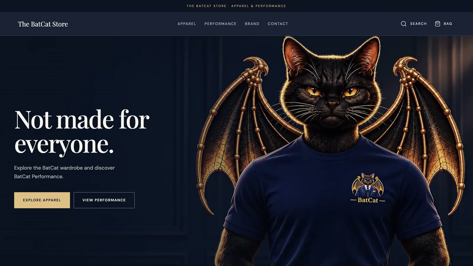
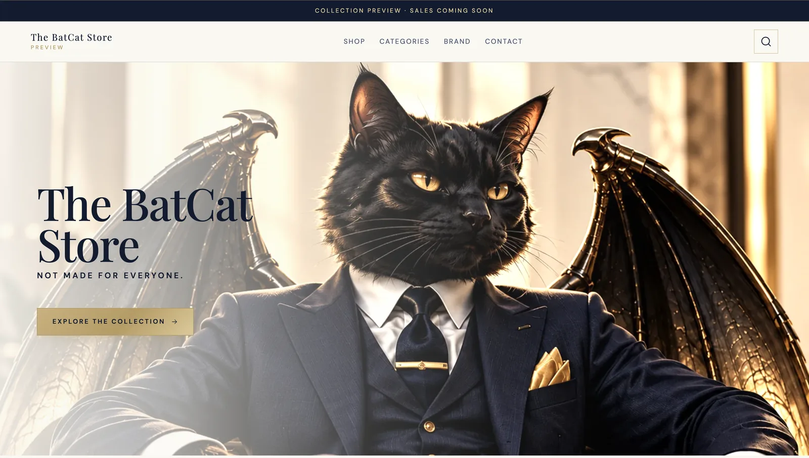
Homepage hero
What wasn’t working
- A faded white overlay washed out the BatCat character.
- The menu listed categories that didn’t exist yet.
- One button that only jumped down the page.
What I changed
- Full-strength character on deep navy, with the brand line “Not made for everyone.” as the headline.
- A clean menu with only pages that exist (Apparel, Performance, Brand and Contact) plus search.
- Two clear buttons straight into Apparel and Performance.
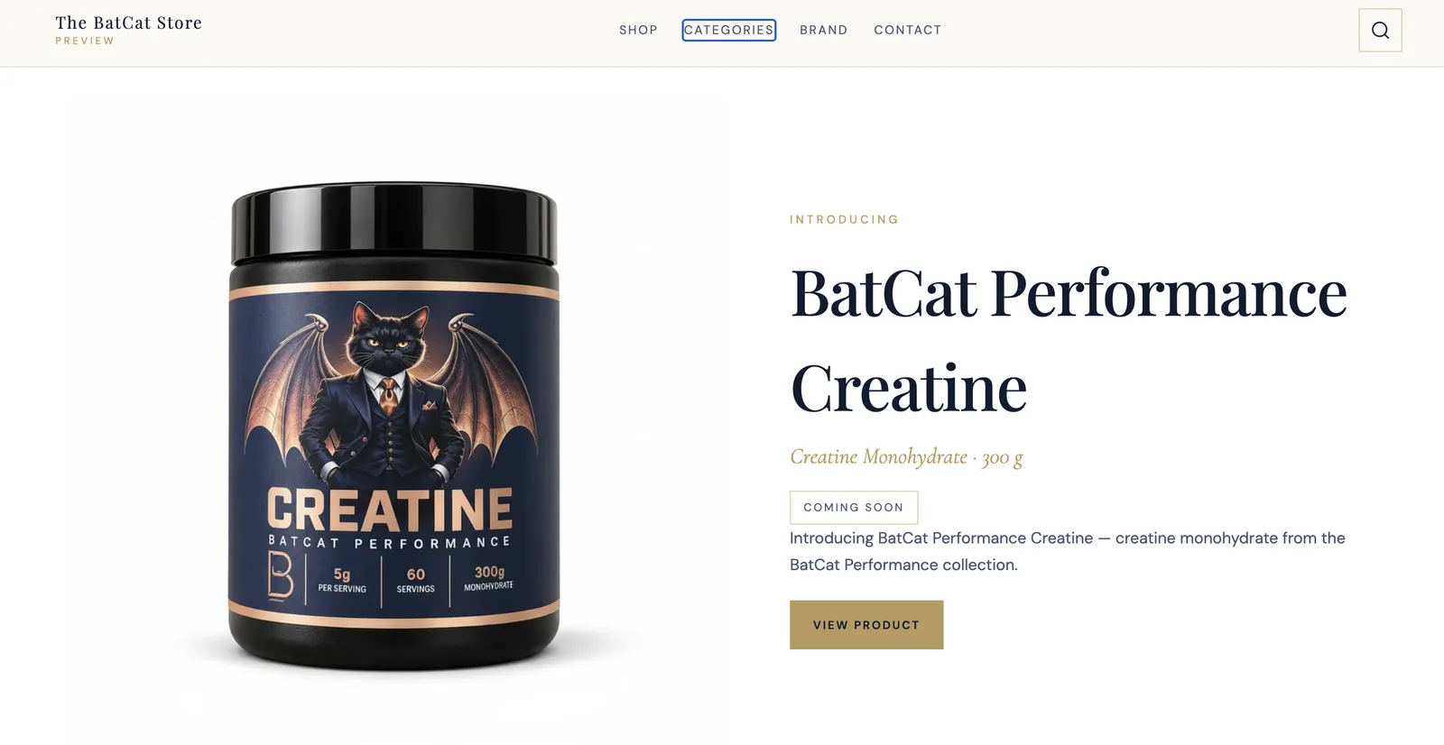
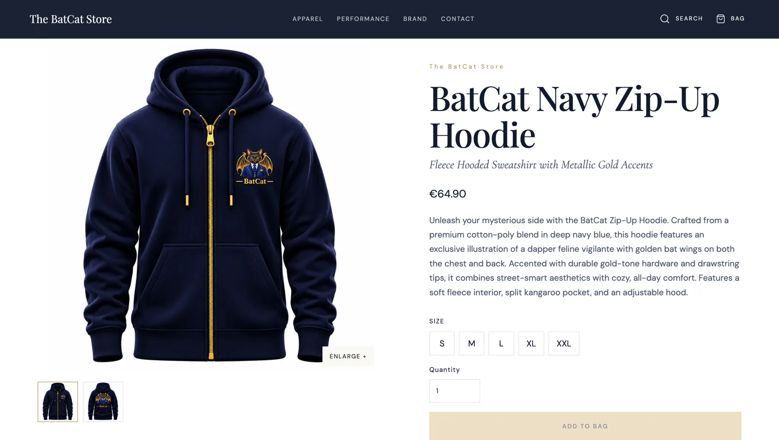
Product page
What wasn’t working
- A “View product” button next to a “Coming soon” label, mixed signals.
- No size, servings or details to judge the product by.
What I changed
- A clear price, a short story about the product, size buttons, quantity and one gold “Add to bag” button.
- A zoomable photo with front and back thumbnails, and shipping details in tidy dropdowns.
Contact page
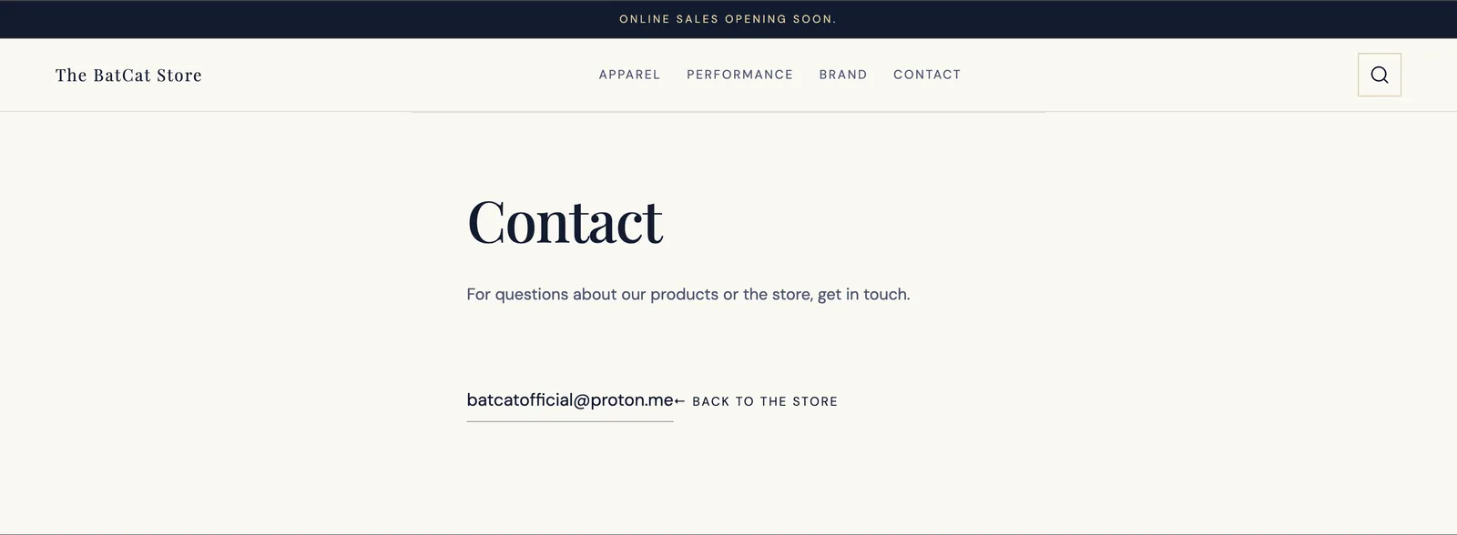
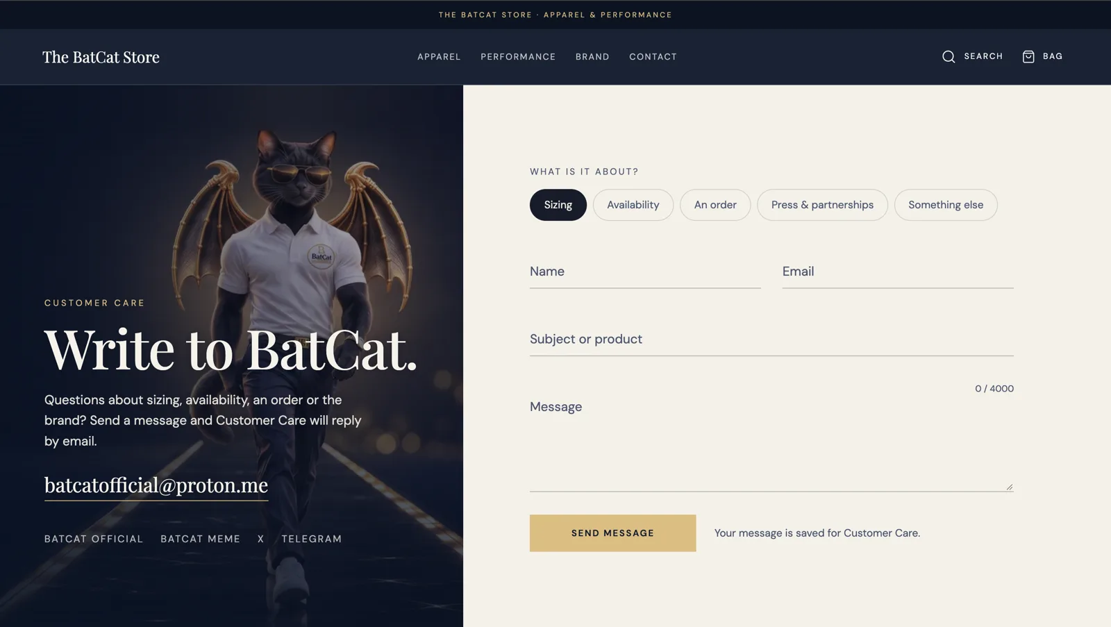
What wasn’t working
- A heading, one line of text and an email address jammed against the “back to the store” link.
- No form, visitors had to open their own email app.
What I changed
- A split layout with the BatCat character beside a real contact form.
- Topic chips (sizing, availability, an order, press & partnerships), so every message arrives already sorted.
- The email address and community links still one tap away.
404 page

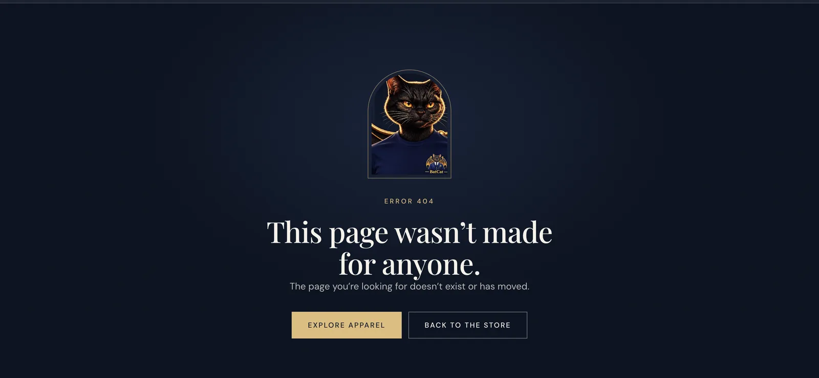
What wasn’t working
- A plain white screen with “404 — The requested page could not be found.”
- No logo, no links: a dead end that loses the visitor.
What I changed
- An on-brand page with a playful line in the brand’s voice: “This page wasn’t made for anyone.”
- Buttons back into Apparel and the store, so a broken link never ends the visit.
Footer
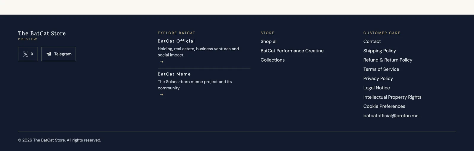
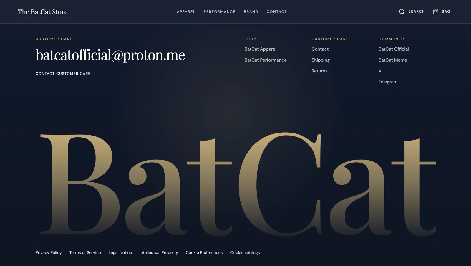
What wasn’t working
- A long list of policy links competing with the shop links.
- No clear place for questions before launch.
What I changed
- The customer care email address first, large and easy to tap.
- Shop, Customer care and Community grouped in three short columns, with the policies moved to a quiet bottom row.
- A big gold BatCat wordmark that closes every page in the brand’s style.
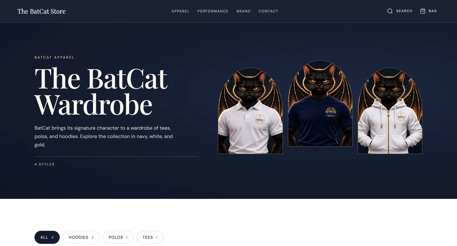
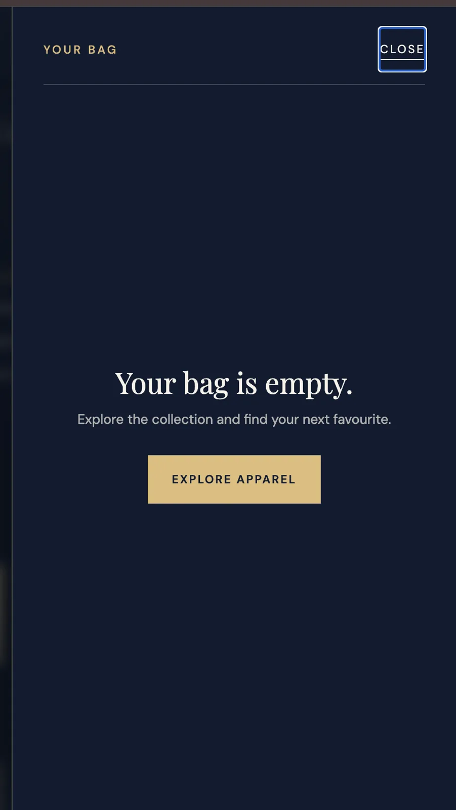
New pages.
Added to the store as part of the redesign.
The brief
The client already ran the shop on Hostinger’s e-commerce builder and wanted to stay there. My role: redesign the look and the shopping experience on the same platform, so the store feels as premium as the brand, and works as a shop.
The approach
A dark navy and gold look that lets the BatCat character lead, a menu that only shows what’s really available, product pages with sizes and a smooth add-to-bag flow, and no dead ends, down to a branded 404 page. Scroll animations reveal each collection as you move down the page, with a moving brand ticker before the footer.
Let’s work together
Want a website like this?
Tell me about your business and goals. I’ll suggest the most useful next step.
- Replies within 24 hours
- Bali · working worldwide
- One person, call to launch