
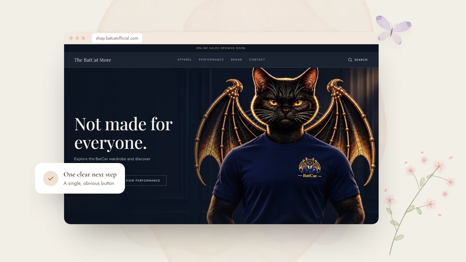
Landing pages are perfect for launches, property listings, special offers and new services. But many try to say everything at once, or push so hard that visitors leave. The best ones feel effortless. Here’s what I focus on.
01One page, one goal
Decide the single action you want visitors to take: request details, book a call, join a waitlist, buy. Every section should support that one step. If a section doesn’t help someone decide, it can probably go.
02Answer the questions in order
Visitors arrive with questions, and a good page answers them in the order they appear:
- What is this? A clear headline in plain language.
- Is it for me? Who it’s for and what it helps with.
- Can I trust it? Real photos, details, reviews or credentials.
- What happens next? A simple, low-pressure call to action.
03Make the next step feel easy
Short forms, a WhatsApp button, a clear “what happens after you click” line, small details remove hesitation. Repeat the call to action at natural moments, but keep the tone warm rather than urgent.
- One goal, one main button
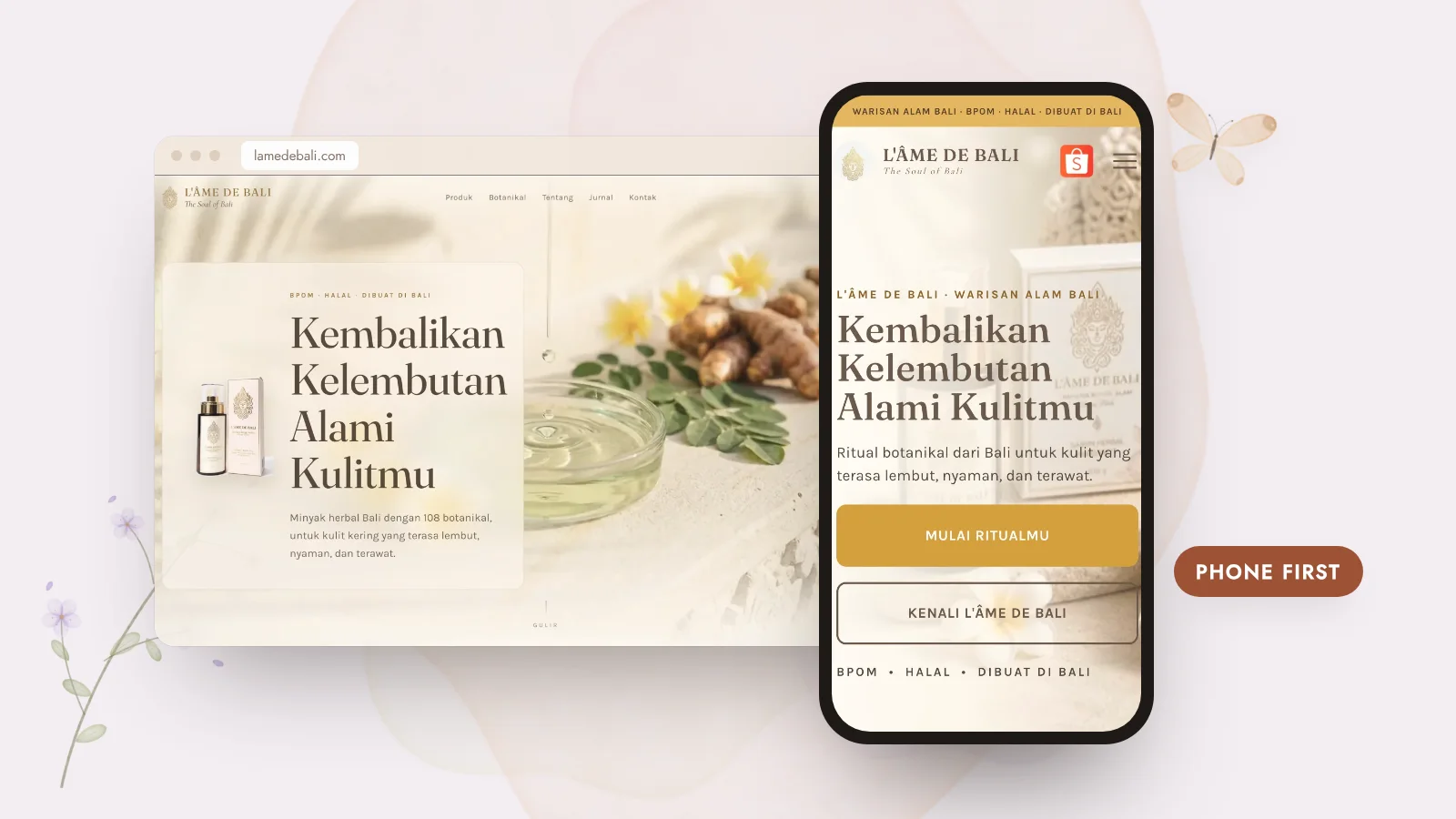
- A headline that says what it is in seconds
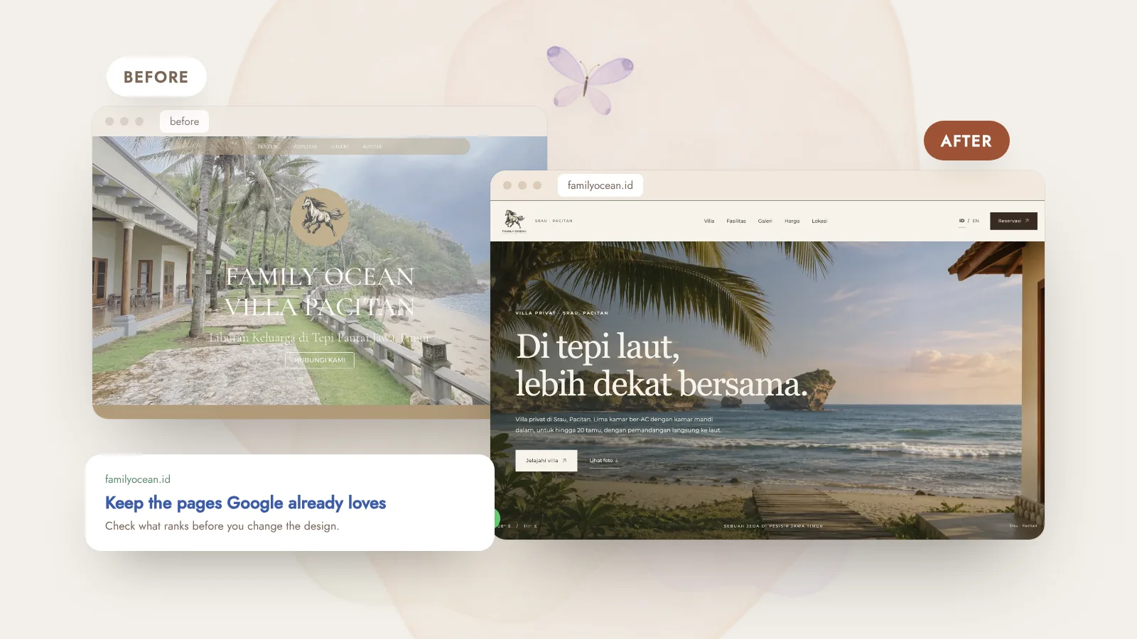
- Real images and trust details
- A short, friendly form or chat option
- Fast and easy to use on a phone
—Calm, clear, beautiful
A landing page doesn’t need tricks. It needs clarity, good design and a respectful invitation. If you have a launch or offer coming up, my Brand Launch Page package is built exactly for that.