
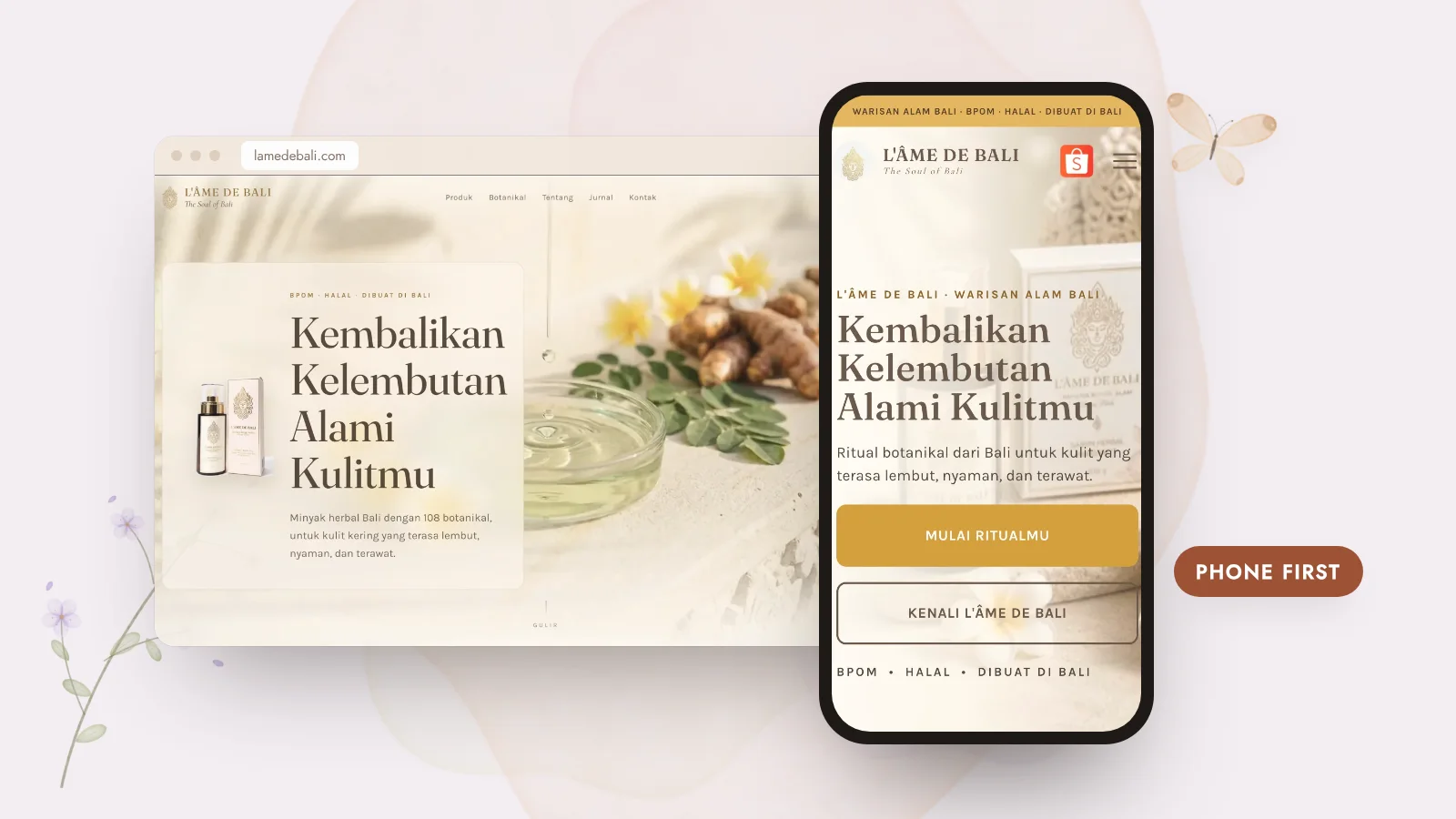
Many people discover a brand through Instagram, TikTok, WhatsApp or a quick search, almost always on their phone. If your website was designed on a big desktop screen and only squeezed onto mobile afterwards, those first impressions can feel cramped or confusing.
01Small screens force clear priorities
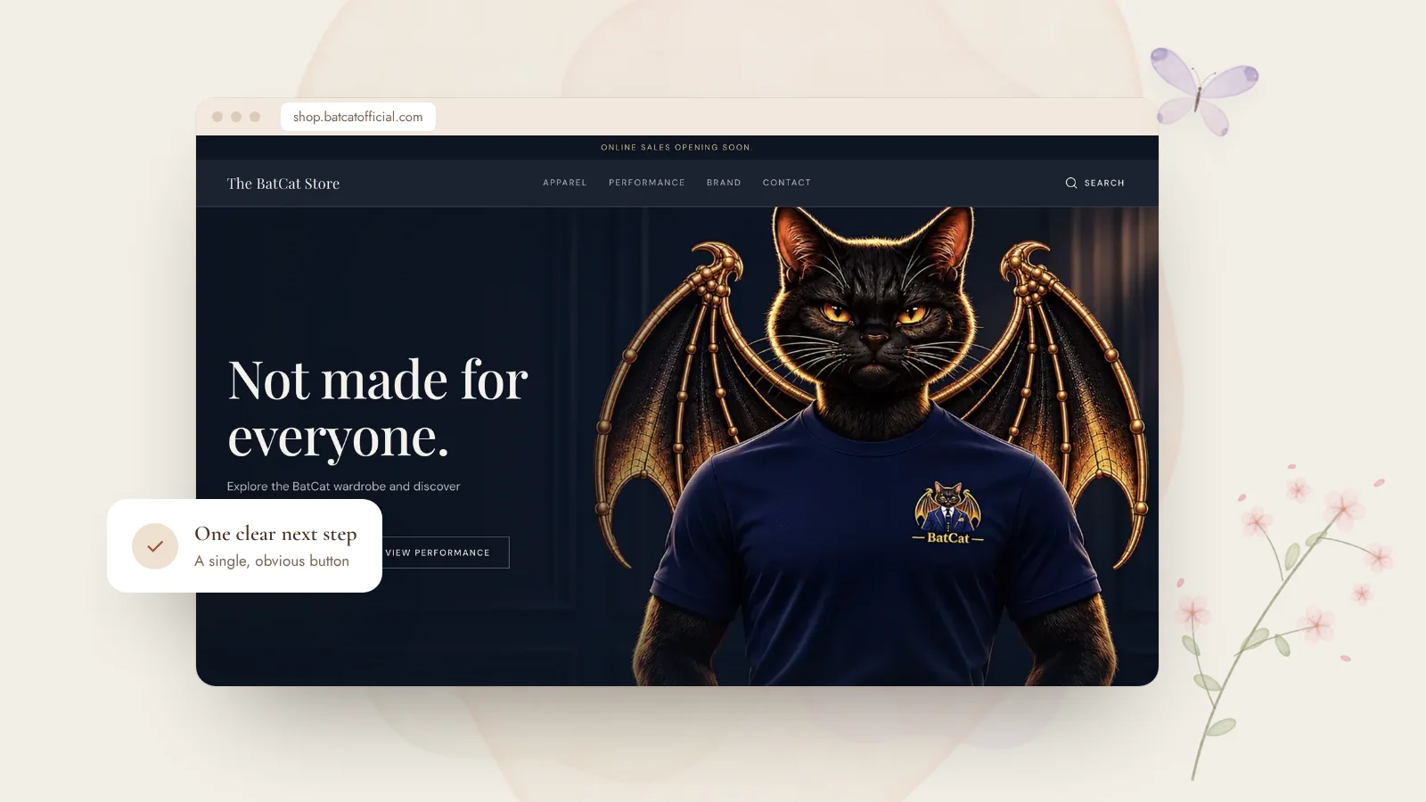
On a phone there’s only room for what matters most. Designing mobile-first means deciding early: what’s the key message, what’s the main action, what can wait? That clarity then carries over to the desktop version, which usually becomes calmer too.
02Thumbs, not cursors
Mobile visitors tap with their thumbs. That changes how a page should feel:
- Buttons big enough to tap comfortably.
- Text readable without zooming.
- Menus simple, with the most important pages first.
- Contact options — WhatsApp, booking, call — always easy to reach.
03Speed is part of the design
Phones aren’t always on fast connections. Optimised images, lighter pages and thoughtful loading keep the experience smooth, and help with search visibility too.
- Open it on your phone: is the main message clear in seconds?
- Can you reach the main button with your thumb?
- Is the text comfortable to read?
- Does it load quickly on mobile data?
—Designed for how people really browse
Every website I build is planned and tested at phone, tablet and desktop widths. If your current site feels awkward on mobile, a refresh can make a big difference. I’m happy to take a look.